http://www.catholiceducation.org/en/culture/media/how-the-media-twist-the-news.html
This article explains different ways in which the media twists the news to suit either their political stance or the individuals personal stance. It includes a really interesting quote from the book 'Public Opinion' by Walter Lippma, 'Every newspaper when it reaches the reader is the result of a whole series of selections.... In order that [the reader] shall enter he must find a familiar foothold in the story, and this is supplied to him by the use of stereotypes. They tell him that if an association of plumbers is called a "combine" it is appropriate to develop his hostility; if it is called a "group of leading businessmen" the cue is for a favorable reaction. It is in a combination of these elements that the power to create opinion resides.'
This quote fits in really well with my essay and also with my practical work in SB2. It enforces the idea of manipulation through the media to control opinions, this could definitely be linked to the media dictating the types of work we make as creatives.
Tuesday, 20 December 2016
Saturday, 17 December 2016
OUIL501- Breaking News
http://www.getty.edu/art/exhibitions/breaking_news/index.html
The aboce image by Martha Rosler shows first lady Pat Nixon stood in front of a framed image of a dead vietnamese woman. This image was made in protest of the way such strong images are shunned by the mass media over other 'celebrity' based images.
'An anti-war protester at the time, Martha Rosler grew frustrated with the way such images were diminished when juxtaposed with trivial advertisements and inconsequential news items.'
I wanted to take this idea of subtlety in image to my own practice, and want to look at how the media can use image to manipulate.
Breaking News: Turning the Lens on Mass Media
Breaking News: Turning the Lens on Mass Media" is a starkly timely group exhibition that examines how artists look to the news media for inspiration and create works that comment on the human condition from the 1960s onward. Martha Rosler, Alfredo Jaar, Catherine Opie, South African artist Adam Broomberg and others take images from all points of the 20th-century experience — ranging from news headlines to bourgeois living to in-depth visual studies of people who report the news — and transform them into something greater and more insightful than they ever were expected to be originally.
'Over the past 50 years, artists have increasingly turned to newspapers, magazines, and televised news programs as rich sources of inspiration. This exhibition explores how artists have looked at and commented on news images, from the Vietnam War in the 1960s to the so-called “War on Terror” in the 2000s. Much of the work is political; all of it is personal. Through photographs and videos, these artists have juxtaposed, mimicked, and appropriated media elements to transform ephemeral news into lasting works of art'.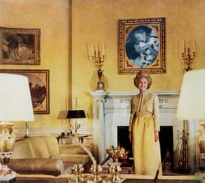
The aboce image by Martha Rosler shows first lady Pat Nixon stood in front of a framed image of a dead vietnamese woman. This image was made in protest of the way such strong images are shunned by the mass media over other 'celebrity' based images.
'An anti-war protester at the time, Martha Rosler grew frustrated with the way such images were diminished when juxtaposed with trivial advertisements and inconsequential news items.'
I wanted to take this idea of subtlety in image to my own practice, and want to look at how the media can use image to manipulate.
Tuesday, 13 December 2016
OUIL501- Studio Brief 2- Development
After considering how the media use headlines to manipulate and advertise, I decided to incorporate some of that idea into my practice. I wanted to shed light on the use of headlines within the media, and the structured techniques and methods used to manipulate.
I decided to make some satirical collages of headlines based around the medias use and the often ridiculousness of the content of the 'news', focusing on certain techniques. I wanted to create an almost 'how-to' of how to write headlines, so I chose to shed light on some of the obvious way headlines are used to snatch attention.
I wanted to keep the illustrative side of the project quite simple and naive as I wanted to reflect unsophisticated and childlike way in which the media created headlines. I think this works effectively and I will look to continue to keep this style, I think establishing this at this point is important as I can focus on the context of the images rather than trying to create 70 final images.
Friday, 9 December 2016
OUIL501- Illustration and the internet
I wanted to research some artists who's practices have gained a lot of attention that they maybe wouldn't have gotten without the platform. I think the main reason some of these are so specifically popular because of the internet is because of the idea of application.

Chris Simpson artist is a great example of an illustrator whom may not have been as popular if it weren't for the internet. As explained above, Chris' illustration don't necessarily have an application outside of the internet- where they are used to purely entertain and serve no other real purpose. For this reason Chris' work is instantly gratifying, it provides quick entertainment and can and will be shares in the masses.
I will ok to discuss this in my essay, discussing how social media has caused some illustrators to become much more popular.

I will ok to discuss this in my essay, discussing how social media has caused some illustrators to become much more popular.
Monday, 5 December 2016
OUIL501- Is News Just Opinion, Gossip and Trivia?
I found this sketch from comedians Clark and Daw today titled 'Is News Just Opinion, Gossip and Trivia?'. The sketch makes fun of the illigitimacy of the news and the headlines they use, and explores sorting the headlines into 3 specifica categories.
The humorous tone of the sketch fits in with the satirical direction that my visual journal and has led me to consider using headlines within my exploration.
The humorous tone of the sketch fits in with the satirical direction that my visual journal and has led me to consider using headlines within my exploration.
Wednesday, 30 November 2016
OUIL501- Useful Resources
(http://www.telegraph.co.uk/culture/art/art-features/11130492/How-has-the-internet-changed-art.html) - article about internet and social media has changed art, how we share it, how we can use it, and where it can take us.
(https://www.forbes.com/sites/kathryntully/2012/10/25/contemporary-art-too-much-of-a-good-thing/#2a9c90412589)- article about the over-saturation of art from social media
(https://www.wired.com/2015/11/jean-jullien-peace-for-paris/)- interview with Jean Jullien about the creation of the Paris Attacks symbols, why he made it, and how it affected his practice.
Michel Faucault- 'What is an Artist?'- lecture about how authorship is portrayed. In response to 'death of an author'- could give an interesting alternative view?
Monday, 28 November 2016
OUIL501- Refining my essay
I have been looking st refining my essay. I think the essay is a bit confused in some ways at the minute, I think I'm trying to get too many ideas into an essay that isn't long enough to discuss them all. I need to start to think about refining the essay down, and eliminating Andy of the subjects that don't directly relate to the title or won't help with influencing my practical work.
I want to find the balance between discusssing social media and news, and talk about the differences between the two. Maybe a short discription of these at the start of the essay will help to outline the ideas efficiently?
I want to find the balance between discusssing social media and news, and talk about the differences between the two. Maybe a short discription of these at the start of the essay will help to outline the ideas efficiently?
OUIL501- Satire
Because of the political and social aspect of my subject, a lot of the related illustrations seem to be based around satirical themes. This also lead me to think about my initial responses in my own practice for COP, and they do have a satirical, almost sarcastic tone to them.
Satire is something I have never really worked with before, and humour is not something I generally include in my work, so I'm a little bit reserved to pursue this. However, it's a great opportunity to explore a side of my practice that I have yet to consider.


Satire is something I have never really worked with before, and humour is not something I generally include in my work, so I'm a little bit reserved to pursue this. However, it's a great opportunity to explore a side of my practice that I have yet to consider.
Sunday, 27 November 2016
OUL501- Study Task 5- Initial Ideas
I wanted to focus my practice for my visual experimentation mainly on shape and line, mostly a blend between the two. I feel my practice has moved more towards digital now and I wanted to take the opportunity to focus on more hand-made marks.
My initial ideas for the visual journal were to move on from my essay and look at how we use social media to project opinions, sometimes as 'news'. I focused on logos as these are the most recognisable symbols of social media, and I wanted to start of my experimentation in the most 'core' part of my chosen subject.
My initial ideas for the visual journal were to move on from my essay and look at how we use social media to project opinions, sometimes as 'news'. I focused on logos as these are the most recognisable symbols of social media, and I wanted to start of my experimentation in the most 'core' part of my chosen subject.
Thursday, 24 November 2016
OUIL501- New media and Social Media
In my essay, I want to explore the ideas that social media and new media (mass communication) has affected the content of the work we produce as creative practitioners.
Potential Themes to Investigates
- How constant interaction with clients and customers has altered how types of work are demanded.
- How 'fake news' and general,news reporting has affected the work we produce and how media 'hype' can create an influx of illustrated works.
- How social media can create a new market for other rising illustrators and more specifically, a new genre of work (memes).
Monday, 21 November 2016
OUIL501- Study Task 4- Images and Theory
Reproduction
'the action or process of copying something.'
How Could this Link to my Project?
- Reproduction as a technique used in practice
- Reproduction of others' works
- Idea of reproduced art, rather than one off pieces
- No more original ideas.
Links to Visual Culture
- Commodification of art through social media
- Reproduction of themes and ideas in advertising
Postmodernism
' A late 20th-century style and concept in the arts, architecture, and criticism, which represents a departure from modernism and is characterized by the self-conscious use of earlier styles and conventions, a mixing of different artistic styles and media, and a general distrust of theories.'
How Could this Link to my Project?
- Changes is aesthetics caused by changes in how work is shared
- Moving on from traditional methods of sharing and creating work.
Links to Visual Culture
- Blending of aesthetics
- Moving back towards old school methods and aesthetics.
Meta communication
'metacommunication (plural metacommunications) Communication that indicates how verbal information should be interpreted; stimuli surrounding the verbal communication that also have meaning, which may or may not be congruent with that of or support the verbal talk.'
How Could this Link to my Project?
- Lack of ability to comminucate through visual cues because of people working digitally and not communicating in person.
- Expression used to communicate ideas through symbols, emojis etc.
Links to Visual Culture
- Communication through symbols
- Hidden meanings in advertising
Wednesday, 16 November 2016
OUIL501- Change of Direction
After cosidering following a similar path to last years essay, I have now moved onto a totally separate subject. I want to do something different to last year, and want to move away from the retail side of it as much as possible, whilst still in keeping with my interests. I wanted to look at how social media is changing how and why we make work, and how this can influence the context behind our work.
I want to start investigating why, as creatives, we make the work we do and start to find out weather social media and mass media have any significant influence over it. My initial point of research will be looking for different examples of works influenced directly by social or mass media and move from there.
Tuesday, 15 November 2016
OUIL501- Proposed Question
How can our exposure to new media and social media affect the context and content of the work creative practitioners produce?
With my essay I will look to explore how social media and new media is used by creative practitioners and how the use of these platforms is influencing what we create as practicing illustrators. I will look to use theorists and theories focussing on social media and spread of mass media to back up my arguments.
Monday, 14 November 2016
OUIL501- Initial Ideas for Research Question
Since I was really enjoying what I was doing towards the end of last years COP module I think I would like to carry on in a similar theme. The thing I was most interested in was how we are manipulated to move and interact with a certain object or product and if/how we are influenced to buy it.
I went with this theme last year and already found out some really interesting techniques and methods used, which should hopefully put me in good stead for this year. I really want to focus on how retail shops are designed and laid out to best influence the customer to buy. I think this way of designing retail stores in a specific 'scientific' way is quite a recent thing, so there may not be many theorists or academic papers surrounding the specific subject. So maybe I'll have to gather information from relating subject areas and try to find some that relate to retail layout and design.
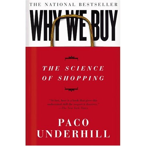
'Why we Buy' by Paco Underhill, is a great place to start with this subject area. In it, he outlines basic methods and techniques that retail designers use to a) keep the customer in the store for as long as possible, and b) make them buy as much as possible.
I think this mostly relates to the cultural side of COP, and think there are numerous links that can be made to differing artist and subjects, especially within marketing and advertising.
This may however be difficult to explore practically, as a lot of the subjects I will be talking about will be design specific, rather than responsive art or illustration, so I will need to avoid it becoming more of a design experiment (maybe?).
I think I need to start by discussing with Pete my actual subject, which hopefully will happen next week, and hopefully he could shine some light on where I should be going with this idea. And also research more. Find images.
I went with this theme last year and already found out some really interesting techniques and methods used, which should hopefully put me in good stead for this year. I really want to focus on how retail shops are designed and laid out to best influence the customer to buy. I think this way of designing retail stores in a specific 'scientific' way is quite a recent thing, so there may not be many theorists or academic papers surrounding the specific subject. So maybe I'll have to gather information from relating subject areas and try to find some that relate to retail layout and design.
'Why we Buy' by Paco Underhill, is a great place to start with this subject area. In it, he outlines basic methods and techniques that retail designers use to a) keep the customer in the store for as long as possible, and b) make them buy as much as possible.
I think this mostly relates to the cultural side of COP, and think there are numerous links that can be made to differing artist and subjects, especially within marketing and advertising.
This may however be difficult to explore practically, as a lot of the subjects I will be talking about will be design specific, rather than responsive art or illustration, so I will need to avoid it becoming more of a design experiment (maybe?).
I think I need to start by discussing with Pete my actual subject, which hopefully will happen next week, and hopefully he could shine some light on where I should be going with this idea. And also research more. Find images.
Tuesday, 25 October 2016
OUIL501- 10 Areas of Interest
Fake News- It's influences on creative practitioners and the work they produce.
Social Media- How it's changed the work we create.
Over-saturation of Art- How over-saturation of art has changed the kind of work we produce.
Demand for Art- How and why the demand for art has changed.
Why we Buy- How advertising has changed what we buy and the way we buy it.
Retail- Following on from 401, how illustration and art has changed the way we use retail spaces.
Consumer Influence- How the work being created by creative practitioners is being influenced and demanded by consumers, and how it's changing the context of work being produced.
Recreational Drugs- How the use of drugs in creative practices is viewed externally and its effects on the work being created.
Modern Propaganda- How propaganda is used in contemporary culture.
Changes in Propaganda- How Propaganda has changed (its functions, aesthetic, application and effects).
OUIL501- Study Task 3- Triangulation
In the text written by Laura Mulvey 'Visual Pleasure and Narrative Cinema' (1975), she argues that cinema, and the roles projected on women are the source of womens' oppression (pg15), stating that women are often seen as the 'bearer, not maker, of meaning' (pg15) which suggests women are portrayed as the inferior of men in modern cinema. Similarly, in 'Cultural Theory and Popular Culture', John Storey describes the idea of an audience viewing 'women as sexual objects' (pg18), further enforcing the idea of women's inferred inferiority. This is summed up successfully in Dyer's 'Stars and Audiences', in which he describes that this idea of oppression is targeted at a specific category of people, and that 'the moviegoer is positioned accordingly to the pleasures of male heterosexual desire' (pg188).
The idea that women are 'crucial to the pleasure of the Male gaze' (Storey, p82) is a much discussed topic, with a focussed topic in Mulvey's text being the idea of 'scopophilia'(pg18), defined as '
sexual pleasure derived chiefly from watching others when they are naked or engaged in sexual activity; voyeurism' (google), as she goes on to describe how female objectification can occur when people see themselves as 'looking in on a private world' (pg17). This is reflected by Storey, who talks about the sole focus of the female body as a 'pure erotic spectacle' (pg83) for a member of the viewing audience.
Friday, 21 October 2016
OUIL501- Study Task- 2 Establishing A Research Question
Suggested Research Question
- Explore ideas of how 'fake news' is used in social media and how if affects the work we produc.
- Social media and how it's being used to interact with clients and customers
- How social media is being used to change the work we make (demand for certain types of work)
Theorists Relating to this Question?
- Barthes- Death of the Author- style over substance?
- McLuhan- Understanding Media- how social media influences
- Foucault- similar take on Barthes
- Solzhenitsyn- A Warning to The West- how social media and new media can be used negatively.
Academic Sources Available?
- Articles on social media and art, lots of sources
- Theorists- Propaganda and mass/ new media
- Satirical illustrators
- Use examples of different types of illustrators' works.
- Illustrators who became more well known because of social media.
How could the research Question be investigated through Practice?
- Producing satirical work around social media
- Use techniques used by popular online illustrators
- Commenting on social medias use within art
Thursday, 20 October 2016
OUIL501- Study Task 1- Roland Barthes Summary
In 'The Death of The Author', Roland Barthes discusses the links between the author and he reader, and the interpretation of the authors work.
Barthes talks about the authors work becoming somewhat more important when the authors identity and past is removed from it. He states that 'language knows a 'subject' not a 'person' (P145) and that taking the 'person' or personality from a text can instantly alter how the reader perceives it. However, it is argued that in some examples, that the author is and integral part of or understanding the meaning behind the work. Andy Warhol's depiction of famous images are an example of the author being a vital part of the context behind the work. Through using already 'popularised' images, Warhol reworked imagery which was known by everyone, representing prominent contemporary events and interests. For example, Warhol's soup can (1962) were a statement about the repetition of the every day routines of the population, including his own. This is a prime example of the author having meaning behind how the images are viewed, as if you took away the personality and interests, the reader would miss the opportunity to understand the original intended meaning.
Barthes talks about the authors work becoming somewhat more important when the authors identity and past is removed from it. He states that 'language knows a 'subject' not a 'person' (P145) and that taking the 'person' or personality from a text can instantly alter how the reader perceives it. However, it is argued that in some examples, that the author is and integral part of or understanding the meaning behind the work. Andy Warhol's depiction of famous images are an example of the author being a vital part of the context behind the work. Through using already 'popularised' images, Warhol reworked imagery which was known by everyone, representing prominent contemporary events and interests. For example, Warhol's soup can (1962) were a statement about the repetition of the every day routines of the population, including his own. This is a prime example of the author having meaning behind how the images are viewed, as if you took away the personality and interests, the reader would miss the opportunity to understand the original intended meaning.
Wednesday, 4 May 2016
OUIL401- Evaluation
Leeds College of Art
BA (Hons) ILLUSTRATION Level 04
OUIL401 Context of Practice Credits 20
End of Module Self Evaluation
NAME
Matthew Mercer
1. What skills have you developed through this module and how effectively do you think you have applied them?
For me, the biggest skill I have gained from the module is my essay writing skills. I have never really been one for academic writing but I think my skills in analysing, tringulating and being critical of academic texts has improved no end. As well as this, I fell my ability to critically look at other artists work and break down the image has improved, which has in turn helped me to become more critical of my own work so I am ablt to develop that further too.
2. What approaches to/methods of research have you developed and how have they informed your practical outcomes?
One of the biggest influences on my practical outcomes was actual facts and information gained from research, which is something I previously would never have thought would happen. I have really enjoyed researching the theoretical side of art and design and have learned a lot about methods, techniques and ideas behind why certain works are made and the context behind them. This has definitely influenced my final practical outcomes, which have turned out to be more informative rather thatn just images/illustrations for the sake of it. Which I love, it gave me a sense of purpose to what I was making.
3. What strengths can you identify in your work and how have/will you capitalise on these?
I have tried to work quicker with this module, treating my visual journal almost as a sketchbook to get rough ideas down and explore different avenues from them, rather than just trying to greate 20 finished images having not properly explored the idea. I think this lead me to stray further from my original proposal than I thought I would but I really think my work has benefitted from the breadth of research.
4. What weaknesses can you identify in your work and how will you address these in the future?
I think one of the biggest weaknesses for the module is the types of research I have gathered. I feel I could have taken more quotes/ texts from the information I had found. In the latter part of SB2, whilst researching retail layouts, the information I could find was incredibly limited as it is quite a niche subject. So I couldn't really find many quotes of much credibility, but I did find other types of research which influenced the direction of my work. I definitely enjoyed researching my subject, so I wouldn't necessarily change the fact that I chose quite a niche field, but I would definitely gather more bits of information, even if they weren't really key.
5. Identify five things that you feel will benefit you during next years Context of Practice module?
- The techniques learned this year in terms of criticality and research for essay work and practical responses.
- The realisation that COP is actually quite enjoyable once you get started and find an interesting subject.
- I feel my ability to respond practically to information has really improved and will definitely help next year.
- I will know to choose a subject that I am actually intersted in to write about, rather than rushing into one and regretting it.
- I have learned to spread the workload over the year effectively.
6.How would you grade yourself on the following areas:
(please indicate using an ‘x’)
5= excellent, 4 = very good, 3 = good, 2 = average, 1 = poor
1 2 3 4 5
Attendance 1
Punctuality 2
Motivation 3
Commitment 2
Quantity of work produced 3
Quality of work produced 3
Contribution to the group 2
The evaluation of your work is an important part of the assessment criteria and represents a percentage of the overall grade. It is essential that you give yourself enough time to complete your written evaluation fully and with appropriate depth and level of self-reflection. If you have any questions relating to the self-evaluation process speak to a member of staff as soon as possible.
A copy of your end of module self evaluation should be posted to your studio practice blog. This should be the last post before the submission of work and will provide the starting point for the assessment process. Post a copy of your evaluation to your COP blog as evidence of your own on going evaluation.
Notes
Tuesday, 3 May 2016
Tuesday, 26 April 2016
OUIL401- Studio Brief 2- Visual Response Pamphlet Proposed Images
Here are the proposed designs for the pamphlet I was aiming to create to coincide with my realised images.
OUIL401- Studio Brief 2- Realised Visual Responses
There is very very little information freely available about this subject, with most of it kept close to the 'experts' chests, maybe to not give the opposition an advantage. I wanted to illustrate the 5 main theories of retail anthropology and how they work so I began by making images based directly off the theories to give as clear an idea as to what they are as possible.

The first image was meant to represent the 'power wall' theory, an idea that suggests that the first wall on the right as you enter the store should be merchandised with best sellers, high ticket items, and seasonal items, as this is the first thing the customer will notice upon entering the store.

My next image was made to illustrate the 'decompression zone' theory, which explains that anything within 5-15ft of the door (depending on store size) will usually be disregarded by the customers until they enter 'shopping mode' so there is no real point having any product before that point.

My next image is of the 'merchandise outpost', which is where small collections of merchandise are kept at key points of the store, such as till points and at the ends of isles to encourage impulse buys.

My fourth image is to illustrate the 'speed bumps' theory, the theory that by placing small samples of product on a point of sale in between larger selling spaces, it will slow the customer down so to encourage them to spend more time in the store and therefore more time spent browsing/ buying.

My final image is to represent the 'eye level- buy level' theory, which simply suggests that more notice will be taken of product placed on eye level, so high ticket and high sellers should be placed here.
Overall I am fairly happy with how the images have turned out, given time, I may place the images into a small leaflet or pamphlet with some information so to give them a bit more background.
I will look at continually developing through my visual journal to investigate any further avenues.
OUIL401- Studio Brief 2- Useful Links/ Quotes
http://www.cracked.com/article_18805_5-ways-stores-use-science-to-trick-you-into-buying-crap.html
'We know that rotational patterns like this are common in herd animals, like elephants, but nobody is quite sure why humans do it. Studies have shown that British, Australian or Japanese shoppers tend to go the opposite way (clockwise) through the store, so some have speculated that it's based on the side of the road you're most used to driving on. If you drive on the right, you head right and follow the wall around.'
Companies employ psychological theory to influence where we move and where to put key product.
(https://www.shopify.co.uk/blog/13955461-visual-merchandising-101-how-to-create-store-designs-with-high-converting-displays)
'There are an endless array of visual cues you can play around with to communicate your message. From using colors for their psychological triggers, to leveraging lighting, symmetry, balance, contrast, and focus to direct and control where a customer looks and for how long, it's one of the most fascinating components of merchandising.'
Playing around with different colours and balances of visual elements can influence customers where to look.http://newsfeed.time.com/2011/01/27/how-ikea-seduces-its-customers-by-trapping-them/'Using a strategy employed by out-of-town retail parks – “trapping” the customers in store for as long as they can – IKEA places as many distractions as possible between the customer and the item they may have come for. The path is “effectively their catalog in physical form” says Penn. “You’re directed through their marketplace area where a staggering amount of purchases are impulse buys, things like light bulbs or a cheap casserole that you weren’t planning on getting … Because the layout is so confusing you know you won’t be able to go back and get it later, so you pop it in your [cart] as you go past.”'
Most retail companies employ techniques to keep the customer 'trapped' in the store, "the more time people spend in the store, the more likely they are to buy more".
"Several empirical studies of store environments (Groeppel-Klein 2001; Groeppel-Klein and Germelmann 2003; Grossbart and Rammohan 1981; Sommer and Aitkens 1982) show evidence of a significant correlation between the existence of mental maps of stores (knowledge of product location, assortment, service points in malls, escalators, etc.) and consumers’ feelings about how convenient the shopping experience is. Furthermore, Reimers and Clulow (2004) find a significant relationship between mental search costs and 5 the perceived convenience of retail spaces: the more detailed the mental map, the less mental effort needed when searching for products."
Counter-clockwise or clockwise? The impact of the store layout on the process of orienting in a discount store
People use a store in which they are used to using one, through mental maps of other stores?
http://www.fastmoving.co.za/newsletters/retail-126/store-layout-responds-to-consumer-shopping-habits-95
OUIL401- Studio Brief 2- Fundamental Retail Layout
Through my research, I have started to narrow down ideas of retail layout and the psychology behind it.
Below are what I think to be the key ideas and most appropriate for most businesses.
The Decompression Zone
The Decompression Zone is the space that’s located just inside your front door. The size of your DZ will depend upon the size of your sales floor, but it’s generally the first 5’ to 15’ inside the front door. Its purpose is to give shoppers a chance to transition from whatever happened in the parking lot, to your store -- it refocuses the customer on shopping. Your DZ needs to be open, inviting and easy to navigate. Understand that shoppers will miss anything you place here, that’s why the DZ is not the place ideal for carts, baskets, or signing because customers will blow right by them. Instead place these items just outside your DZ where shoppers are more likely to see them.
Speed Bumps
Just past the Decompression Zone is where you place fixtures known as Speed Bumps. These merchandise displays work much the same way as speed bumps in parking lots work: they slow customers down. They also grab their attention and introduce them to the cool product for sale in your store. Speciality fixturing, such as slat board 4-ways, make great Speed Bumps. Small tables work well, too. Use Speed Bumps to feature new and seasonal items and to tell product stories. And be sure to rotate the product on your Speed Bumps at least once a week.
On Your Right: A Power Wall
Walk inside your front door, stop just past your Decompression Zone, and look to your right. The wall you see is called a Power Wall and it’s another one of those key merchandising areas. And because it’s the wall shoppers see first after turning right, it’s a perception builder. If you use this area to house basic product you are making a mistake. Put your best foot forward by using this Power Wall to display important departments, new and seasonal items, to create vignettes, tell product stories, and to feature high demand and high profit items.
(Note: Your store has more than one Power Wall. Stand in various places throughout your store and look around, the walls that stand out are your Power Walls. If yours are non-descript, then use slat board to crop the corners, and you will create instant power walls.)
Merchandise Outposts
The next time you are in a grocery store keep an eye out for displays of product that are placed near or in the aisles. These fixtures are called Merchandise Outposts, and their sole purpose is to encourage impulse purchases. Merchandise Outposts make shoppers stop and think, “I need that!” They provide the perfect opportunity to cross-merchandise in a big way. Department stores jump start sales by loading up the aisles during the holidays with Merchandise Outposts. You should, too!
Eye Level
Information sourced from (https://www.vdta.com/Magazines/AUG07/fc-art-of-the-layout.html)
My first point of call will be to create illustrations based on these ideas as a visual response.
Below are what I think to be the key ideas and most appropriate for most businesses.
The Decompression Zone
The Decompression Zone is the space that’s located just inside your front door. The size of your DZ will depend upon the size of your sales floor, but it’s generally the first 5’ to 15’ inside the front door. Its purpose is to give shoppers a chance to transition from whatever happened in the parking lot, to your store -- it refocuses the customer on shopping. Your DZ needs to be open, inviting and easy to navigate. Understand that shoppers will miss anything you place here, that’s why the DZ is not the place ideal for carts, baskets, or signing because customers will blow right by them. Instead place these items just outside your DZ where shoppers are more likely to see them.
Speed Bumps
Just past the Decompression Zone is where you place fixtures known as Speed Bumps. These merchandise displays work much the same way as speed bumps in parking lots work: they slow customers down. They also grab their attention and introduce them to the cool product for sale in your store. Speciality fixturing, such as slat board 4-ways, make great Speed Bumps. Small tables work well, too. Use Speed Bumps to feature new and seasonal items and to tell product stories. And be sure to rotate the product on your Speed Bumps at least once a week.
On Your Right: A Power Wall
Walk inside your front door, stop just past your Decompression Zone, and look to your right. The wall you see is called a Power Wall and it’s another one of those key merchandising areas. And because it’s the wall shoppers see first after turning right, it’s a perception builder. If you use this area to house basic product you are making a mistake. Put your best foot forward by using this Power Wall to display important departments, new and seasonal items, to create vignettes, tell product stories, and to feature high demand and high profit items.
(Note: Your store has more than one Power Wall. Stand in various places throughout your store and look around, the walls that stand out are your Power Walls. If yours are non-descript, then use slat board to crop the corners, and you will create instant power walls.)
Merchandise Outposts
The next time you are in a grocery store keep an eye out for displays of product that are placed near or in the aisles. These fixtures are called Merchandise Outposts, and their sole purpose is to encourage impulse purchases. Merchandise Outposts make shoppers stop and think, “I need that!” They provide the perfect opportunity to cross-merchandise in a big way. Department stores jump start sales by loading up the aisles during the holidays with Merchandise Outposts. You should, too!
Eye Level
Putting products at the proper eye level will help to improve sales. But it is important to remember whose eye level you are trying to reach. If you are trying to sell a tennis racket to adults, then put the tennis racket at adult eye level. A toy you are trying to sell to children needs to be at a child's eye level.
Information sourced from (https://www.vdta.com/Magazines/AUG07/fc-art-of-the-layout.html)My first point of call will be to create illustrations based on these ideas as a visual response.
OUIL401- Studio Brief 2- Small Project Idea
After spending time researching what it is about shop floor spaces that subliminally manipulate the way we move, I have decided to consolidate the main functional ideologies of how it works into a small pamphlet about retail design, with information and illustrations.
This is the first idea anyway, I think the first point of call is to gather the information and produce some illustrations as a visual response to each idea.
This is the first idea anyway, I think the first point of call is to gather the information and produce some illustrations as a visual response to each idea.
OUIL401- Studio Brief 2- Paco Underhill
My research throughout this brief has led me to a man called Pace Underhill. Paco is an environmental anthropologist, someone who studies psychology in society and the way we interact with our surroundings. The thing that first drew me to Paco is his book 'Why We Buy: The Science of Shopping'. In the book Paco discusses his own theories on how people interact with the store they are in, although this isn't directly related to art of illustration, it does shed a light on design and store layouts and how it can affect the way we interact with the store subliminally, which seems to be the direction in which my research is taking me.
'The Apple store is not a store. It is an exercise in evangelism' (Paco Underhill)
I really like this quote from Paco, it ties in with the idea that the psychology behind the store is not to sell, but to implant the idea of the brand. Who goes into an Apple store and actually buys anything? No one. Its almost just to show off or preach to 'customers' about the brand.
Monday, 25 April 2016
OUIL401- Studio Brief 2- Statistical analysis of how we move around shops
Although a lot of this sounds like total bollocks. He basically says that people respond dramatically to their surroundings in a store. But the layout of which is totally personal.
Wednesday, 13 April 2016
OUIL401- Studio Brief 2- Colours In Retail
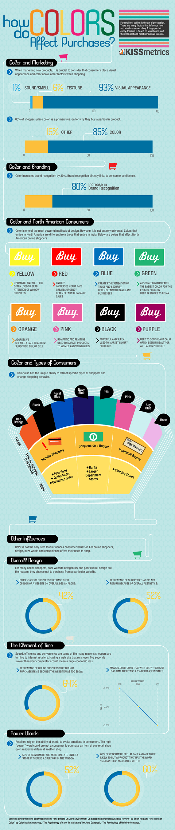
Today whilst researching I came across this image which explained how genders react to differing colours, focussing on retail.
I will try to look at incorporating some of these theories into my visual journal and explore creating work around these ideas,
I will try to look at incorporating some of these theories into my visual journal and explore creating work around these ideas,
OUIL401- Studio Brief 2- Moving around a Space
 I went on to look at how the shop was laid out, to see if there were any visual cues as to where certain customers would move to. I started by looking at shop front and how people would move from the entrance.
I marked out the different potential routed to take and noted the reasons why people would move there. The top image is from the shop front; it is fairly obvious that the left side is mens and the right is womens, mainly from the colour choice of the clothing. However there are other visual cues that encourage the separation. The obvious different sexes of the mannequins is one, and the fact that the mens clothing is hung higher than the womens (for ease of access) is another.
The rail lights direct the eye straight to the back of the store, immediately drawing your attention to it, this is where the key product and arguably the most important stuff happens.
This 'automatic' reaction however obvious it might seem, I found really interesting, and am keen to try and implement them into some of my future work. This will mean looking a lot more at visual composition of an image to create paths and focuses.
I want to start looking at the methods that retailers use to dictate how we move around the store, and how they use subliminal messages to keep us shopping.
OUIL401- Studio Brief 2- Change of Direction
(Excuse the subject pun)
My thoughts are now turning more towards how we interact with spaces and images, I have begun investigating specific cases of how we are influences to move around an area without being told in an obvious way and without knowing about it.
My initial thoughts went towards retail. From working in retail for a few years, I understand that shop floors are designed and manipulated in a way to influence customers to move around the store to best encourage them to use the store to browse properly.
I looked into retail floor plans and how they are arranged to dictate where customers move to maximise browse times. I found an article online which explains basic floor plan layouts and how people usually interact with the spaces. I found this really intriguing and wondered if this movement could be recreated though visual design. (http://fitsmallbusiness.com/planning-your-store-layout/#)
I think my next step will be to explore these layouts and understand how these shapes and paths are used and try to reflect this theory in my own work.


From this idea, I started to create some images which reflected the ideas discovered in my research. Below are the results.


I think now what I need to do is further investigate the actual theory behind how shops are laid out. Maybe looking at some of the specific techniques and ideas they employ.
My thoughts are now turning more towards how we interact with spaces and images, I have begun investigating specific cases of how we are influences to move around an area without being told in an obvious way and without knowing about it.
My initial thoughts went towards retail. From working in retail for a few years, I understand that shop floors are designed and manipulated in a way to influence customers to move around the store to best encourage them to use the store to browse properly.
I looked into retail floor plans and how they are arranged to dictate where customers move to maximise browse times. I found an article online which explains basic floor plan layouts and how people usually interact with the spaces. I found this really intriguing and wondered if this movement could be recreated though visual design. (http://fitsmallbusiness.com/planning-your-store-layout/#)
I think my next step will be to explore these layouts and understand how these shapes and paths are used and try to reflect this theory in my own work.
From this idea, I started to create some images which reflected the ideas discovered in my research. Below are the results.
I think now what I need to do is further investigate the actual theory behind how shops are laid out. Maybe looking at some of the specific techniques and ideas they employ.
OUIL401- Studio Brief 2- Continued
From my investigation into directional arrows, this led me to investigate road signs and other tools which are used to influence how we move. I created some images based off these ideas, experimenting with the colours and wording used in them.


OUIL401- Studio Brief 2- Image Exploration


I'd like to start investigating this in my own visual journal and possibly look at developing my own parodies of road signs and other instructional materials.
OUIL401- Studio Brief 2- Continued
Again focussing on directional arrows, I went on to explore the boundaries of what could be used as a symbol to follow, what it required and what the limits were.
I began by simplifying the shape, only using the triangular tip to dictate direction, then went on to explore different shapes which could potentially used to show direction.


Through this process, I became interested in the subliminal way we are instructed around a space.
I began by simplifying the shape, only using the triangular tip to dictate direction, then went on to explore different shapes which could potentially used to show direction.


Through this process, I became interested in the subliminal way we are instructed around a space.
OUIL401- Studio Brief 2- Continued
Other theories on the initial uses of directional arrows came from bow and arrows. The theory being that it is a humanistic reaction for us to follow arrows. From the early days of hunter-gathering, arrows and spears would have been used to hunt animals and fight; with both only travelling in one direction, It is an automatic reaction for us to follow this.
OUIL401- Studio Brief 2- Simplification of Image
I wanted to look at some visual symbols and how we respond to them. As a small experiment, I took 3 bottles, and simplified the image down to what I thought to be it's simplest form. The bottles all follow the same rough visual aesthetics, with a cap at the top, textured sides and a flat base. But I wanted to know if I could still distinguish what exactly the individual bottles would contain, simply from the rough shape.

OUIL401- Studio Brief 2- Initial Exploration
My initial exploration for the brief was fairly simple. I wanted to look at the most obvious elements which control how we think and what we assume. I started to investigate directional arrows.
Most symbols that we follow are representational of something (examples below)
However, directional arrows are not necessarily representational of a specific element which we assume to follow. I began investigating the origins of the arrows, and the first uses of arrows as a symbol to follow.
The earliest symbol that I came across was in Pompeii in 75AD. Phallic symbols were carved into walls and floors to direct 'customers' as to where a brothel could be found. With the tip pointing towards the direction to follow. I decided to investigate how this may look if it had caught on and been the norm today.


Studio Brief 2- Proposal
I wanted my visual response work to somewhat link in with my essay work. From my investigation into propaganda through my essay, I was intrigued by how design can influence the way we think, interact, and move. My natural progression of thought from this was to move on to investigate specifically what elements of design can affect our mentality.
I decided that I wanted to look at visual symbols and techniques which are used, and how they are used. After considering what I wanted to look at, I created the following proposal.
'To investigate how visual elements can be used to manipulate the way we think, control what we assume and how we react when looking at them.
Investigating differing types of persuasive techniques and symbols, I will look at the visual applications of these, be it social, instructional or subliminal.'
My thought behind the wording of this proposal was chosen so it could give me freedom to explore as many elements of design as I pleased, but also would give me the opportunity to investigate specific elements and explore them further if I should so choose.
Friday, 1 April 2016
OUIL401- Studio Brief 2- Initial Proposal
BA (Hons) Illustration - Level 04 Name Matthew Mercer
Module: OUIL401 Context of Practice 1 Date
STUDIO BRIEF 2: Visual Response
The Themes I am going to explore are….
1. Simplified visual cues.
2. Instructional art
3. Art that affects how we think
The theories that will in form my work are…..
1. Where these symbols originated.
2. How visual cues are being used in modern times.
3. The use of symbols as a visual trigger.
The specific subjects that I want to investigate are………
1. How we react to road signs
2. How we see some images as things to automatically follow
3. How we are influenced to move/ do things without directly being told.
In order to visual investigate this content I will……..
1. Research why we respond rapidly to certain colours/symbols
2. Create new images based off the theories I research.
3. Respond visually and informatively to my findings whilst researching.
Friday, 26 February 2016
OUIL401- Studio Brief 1- Artist Analysis
Shephard Fairey is arguably best know for the now widely love 'obey' posters, so the fact that he created a poster for a political figure in America could be seen as being a little bit hypocritical? The reason of his creation of the 'OBEY' poster and figure, to me see like it was almost protesting against political domination, and seemed to commentt that we are dictated to 'obey' by a higher power. Now the fact that he created an almost promotional material for a politition seemed a bit counter intuitive.


However, the 'HOPE' image, is now arguably one of the most influential pieces of art within the past 10 years, and I would argue it definitely had a lot of positive feelings generated for Obama. A lot of people seemed to pick up on the hypocrisy of Shephard, and he got a lot of stick for it, which is probably why he reworked the image later on. Very poor play Shephard.

However, the 'HOPE' image, is now arguably one of the most influential pieces of art within the past 10 years, and I would argue it definitely had a lot of positive feelings generated for Obama. A lot of people seemed to pick up on the hypocrisy of Shephard, and he got a lot of stick for it, which is probably why he reworked the image later on. Very poor play Shephard.
Wednesday, 10 February 2016
OUIL401- Studio Brief 1- The changing face of protest art
Whilst researching for this module, I became intregued as to how protest art has changed over time. What I found most interesting is that it seems protest has become much less personal. In recent times, protest art doesn't seem to be something that people hold on the picket line anymore; now it seems to be bites of information left by individuals to represent an idea, which is then capitalised on by the masses.
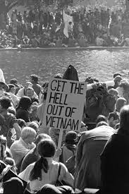
This image was taken around the time of the war in Vietnam. Lots of people stood out in protest, as individuals, but as one mass and one idea.


Now though, this seems to be the standard for protest art. Even simply googling the words 'protest art' brings up a wall of Banksy (or Banksy wannabes) and their messages. I apreciate that the ideas portrayed in these images is probably shared by many, but it just seems very impersonal and faceless.
Maybe this is something I could address in my essay in future. Im pretty sure referencing Bernay's Propaganda in the 60s and comparing it to a more recent publication could give a cool comparison between the two times.
This image was taken around the time of the war in Vietnam. Lots of people stood out in protest, as individuals, but as one mass and one idea.
Now though, this seems to be the standard for protest art. Even simply googling the words 'protest art' brings up a wall of Banksy (or Banksy wannabes) and their messages. I apreciate that the ideas portrayed in these images is probably shared by many, but it just seems very impersonal and faceless.
Maybe this is something I could address in my essay in future. Im pretty sure referencing Bernay's Propaganda in the 60s and comparing it to a more recent publication could give a cool comparison between the two times.
Subscribe to:
Comments (Atom)