Monday, 18 December 2017
Saturday, 16 December 2017
Friday, 15 December 2017
Thursday, 14 December 2017
Friday, 8 December 2017
Run Advert- Colour Comparison
Based on the information I gathered from my surveys, I decided to mock up 2 colour versions of the Run poster comparing their effects visually against the theoretical proposal of colours.

I think both of the ad work effectively in advertising running in different ways. However I think I will be moving forward with the green ad, as I think it best illustrates the way I am wanting to advertise running.

I think both of the ad work effectively in advertising running in different ways. However I think I will be moving forward with the green ad, as I think it best illustrates the way I am wanting to advertise running.
Friday, 1 December 2017
How Typography Affects Readership and Psychology
https://blog.kissmetrics.com/how-typography-affects-conversions/
This article gives a great breakdown of how font and typography can influence psychology on a practical level.
Some useful tips:
This article gives a great breakdown of how font and typography can influence psychology on a practical level.
Some useful tips:
- Variety is good, but don’t go overboard. Your copy should not be a display of your favorite typefaces. Simplicity is key.
- To find the perfect typeface, study your niche and your audience. Does the typeface need to be formal or informal? Does it need to be larger? The answers can be found by performing simple market research, if necessary. But, if you are selling a product that will give people 20/20 vision, most likely your target audience will consist of people who are visually impaired in some form. So, in this case, using a simple large-size typeface is a no-brainer.
- Choose a typeface that keeps your text both legible and readable. One way to do it is by picking a typeface that has large counters (the areas of the letters that are entirely or partially enclosed).
- Do not capitalize every word or the first letter of every word in your copy. Ninety percent of the text that people read online is in lowercase.
- When it comes to line length, don’t keep it too short because the need to constantly shift the eyes will make reading difficult. On the other hand, lines that are too long sometimes can make it difficult for readers to find the next line.
- Make sure to optimize the letter spacing for the right density so that the words don’t look cramped and crowded, which can leave your reader frustrated and confused.
Thursday, 16 November 2017
Typography Experimentation
I wanted to conduct a small experiment into the effectiveness of type in advertising. One widely used marketing technique is SALE banners, used by pretty much every retailer, and a quick google search shows that the type used within these banners are pretty consistent- a bold, sans serif style font with a red background, regardless of whether the font fits with the brand's visual identity or not.
I tried to use different fonts within a simple sale poster and judge the effectiveness of the posters. Clearly a few work better than others, and generally sans serif is the best way of conveying a message via print (physical and digital). However, there are certain alterations of the font definitely help in its effectiveness.
I decided to break down the reasoning behind this consistent typography using research found from secondary sources, using quotes as back-up.
Boldness
Boldness may have a more negative meaning. It may be made to mean ‘domineering’, ‘overbearing’.” (Van Leeuwen, 2006, pp. 148)
Simplicity
'If your message is direct and straightforward, use a rigid typeface without any ornaments (Li, 2009). The simplistic font will match the simplistic nature of the context — thus increasing fluency'
Bold
Oosterhout (2013) also found that uppercase letters are effective for “hero” brands that convey qualities related to energy, courageousness, and focus
Sans Serif
'Audiences perceive sans serif fonts as clean and simplistic in a modern way. They allow the message to speak for itself without hiding behind a façade—straight and to the point in an objective way. Sans serif fonts are typically used in digital design, so they carry a reputation for being contemporary and current no matter what decade you use them in'. (Gendelman,2015)
Putting this all together it seems that the aim of the sale banners is to be dominating and overbearing and powerful. Creating urgency and assertiveness within peoples subconscious to persuade them to buy, and buy fast.
Thursday, 9 November 2017


Wednesday, 8 November 2017

Thursday, 2 November 2017
Colour Survey Results
Here are the results of my survey asking what colours people associate with each of my advertised activities. These are the colours I will move forward with using in the production of my poster.
Wednesday, 1 November 2017
New Direction for Practical Study
Following on from the previous post, I realised the importance of branding and branded colours when it comes to marketing products. So I wanted to be able to experiment with whether it was possible to market ambiguous products, with no branding or colours associated with them.
My idea is firstly to think of products to sell that have no brand, (possibly actions?) then take surveys on what colours people associate with them, if any, and compare this to what generally accepted colour theory suggests and see whether they match up. Then I want to try and produce a series of images effectively advertising them, and see which colour is most effective in selling it. This will obviously involve a lot of survey taking, but should hopefully result in some quantifiable evidence to support my research.
My idea is firstly to think of products to sell that have no brand, (possibly actions?) then take surveys on what colours people associate with them, if any, and compare this to what generally accepted colour theory suggests and see whether they match up. Then I want to try and produce a series of images effectively advertising them, and see which colour is most effective in selling it. This will obviously involve a lot of survey taking, but should hopefully result in some quantifiable evidence to support my research.
Colour and Value Survey Results
To get a face value idea of how effective colour can be with regards to perception, I created two images of shopping bags, with nothing different but the colour. I chose to use bags so that the idea of shopping and purchasing would automatically be assumed by the people taking the survey.


The results of the survey were obviously unanimous, with everyone who took the survey selecting that the red bag seemed of less value. This ties in with my research and especially with the ideas suggested in Packard's Hidden Persuaders. Our subconscious automatically associates red with value, when it comes to shopping and retail- or maybe our subconscious assumes black is more valuable because of associations of luxury.
Maybe colour association goes past what was recognised in earlier posts and most things will have a colour linked to them?
Maybe colour association goes past what was recognised in earlier posts and most things will have a colour linked to them?
Monday, 30 October 2017
Practical Proposal
What Do I Want To Do?
I want to create 4 images based on theory found through primary and secondary research. I want to be able to improve my skills as an advertiser- and I feel a better understanding of colour theory and typography is an essential part of this.
My main proposal is to create a series of 4 images, advertising ambiguous entities with no brand or visual association attached to them, possibly actions?
Contextual Research
My main sources of research will be secondary research found through my research into the essay side of the module. However, I want to be able to gather my own primary information based on surveys to help me better understand how my images are seen by the public- I think this will be the best way to discover whether the theory I am using actually works.
Sunday, 29 October 2017
Appropriate use of TYPE

Nike- BOLD ITALIC- Fast paced, bold, exciting.
Cadbury- SCRIPT- Fun and energetic

Cook Book Cover- Light Sans Serif- Simple, sophisticated, light
Thursday, 26 October 2017
Colour Recognition in Branding
I decided to experiment with how important colour is in brand recognition. I decided to exlude the colours of a logo and reproduce them as a series of circles- to keep the shape of the logo as ambiguous as possible. See results below


With the McDonald's and Burger King the results were pretty unanimous, however with Dove and Coors the results were mixed. Is this something to do with the popularity of the brand? Or are the colours of McDs and BK so ingrained in peoples subconsious?
Maybe this links back to the theory that colour relation is dependant on culture age etc rather than a generalised theory?
Monday, 23 October 2017
Friday, 13 October 2017
Wednesday, 11 October 2017
Rolex Advert Experiment


The results of the survey were quite surprising, the image with the branded colours included, as well as the logo, was immediately recognisable as to what the image was trying to promote. However, as soon as the colours were altered and the branding removed, the people surveyed were mostly unable to even recognise the object in the image. Is branding and colour scheme really that important to marketing or is it possible to market a product with no brand or colour scheme associated.
Tuesday, 10 October 2017
Counter Argument Article?
https://www.fastcodesign.com/3061384/are-branding-agencies-still-relevant
'Increasingly a brand is defined by what a product actually delivers, not by how the marketers tell us how we should feel about it.'
'It comes down to this: Which comes first, the product or the brand? And who actually cares? '
'Increasingly a brand is defined by what a product actually delivers, not by how the marketers tell us how we should feel about it.'
'It comes down to this: Which comes first, the product or the brand? And who actually cares? '
GAP- Time to Rebrand
GAP has been heavily criticised for its branding having no clear direction- and this has been part of the issue of its failing sales.
'Gap’s profits fell to $219m for the three months ending August 1, down from $332m the year before. Sales, meanwhile, fell to $3.9 billion for the period.' (https://www.marketingweek.com/2015/08/21/three-ways-gap-can-revive-its-outdated-and-limp-brand/)
'The biggest blow to the Gap brand, analysts say, is its murky brand identity. Gap used to represent "effortless cool." Now it has no clear position, and that's costing it market share', (http://www.adweek.com/brand-marketing/gaps-biggest-problem-it-lost-its-brand-identity-165367/)


This could have decent potential to rebrand based on original values?
Monday, 2 October 2017
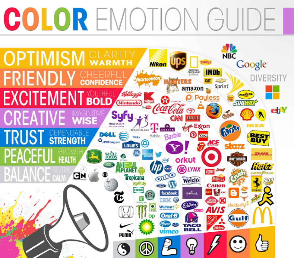
Use of Colour in Visual Identity
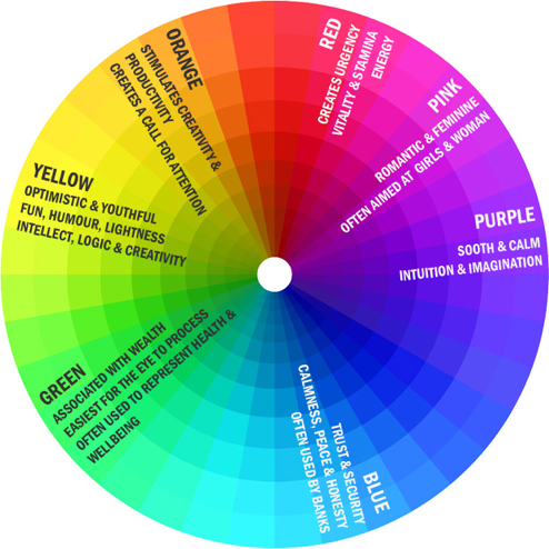
I started to consider the different elements which can build a visual identity of a brand and how it can affect the psychology of the public. I began with looking at colour and how different colours used in brands can affect the perception of brand image.
The above chart gives a good example of how the different colours can change this and how brands can use this within their visual identity.
Visual Identity: Promoting and Protecting the Public Face of an Organization- Susan Westcott Alessandri (2009)
Key Quotes
- 'An organisation's image typically results from two type of associations- those that are inherent and those that are built over time'
- 'Just a person's name, appearance, clothing style, and behavior make up his or her identity, and organisation's visual identity stems from its mision and manifests itself in the organisation's behavior and the visual way it represents itself: its name, logo, tagline, color palette, and even the architecture of the buildings in which it is housed'.
- ' Consumer packaged-goods companies may habve the most visible of visual identities, since the public is used to seeing these identities in a variety of media, but organisations of all sizes, types, and levels notoriety have visual identities.'
- 'A positive identity is establishes in order to gain a favourable reputaion over time'.
Development of Essay Question
‘To what extent does visual identity affect the public perception of a product or brand?’
Through my continued research over summer, I have revised my original essay question and have tried to focus on a more specific element of branding and marketing, whilst still keeping potential topics quite open ended.
My revised essay question allows me to investigate marketing and branding, as well as it's effects on public perception of a brand- meaning I will have to use a few case studies to back up and re enforce my arguments.
Visual Identitiy
One term that has kept coming up through my research is the idea of a company's 'visual identity', here is a quick definition:
'Visible elements of a brand, such as color, form, and shape, which encapsulate and convey the symbolic meanings that cannot be imparted through words alone. In a broader (corporate) sense, it may include elements such as building architecture, color schemes, and dress code'.
I think for my research, this is a really good direction for me to move towards- rather than focusing on branding and marketing, I think I should be looking specifically at the visual identity of a company, as I think it encompasses marketing, branding and public perception as a whole.
'Brand Thinking and Other Noble Pursuits'- Debbie Millman
Brand Thinking and Other Noble Pursuits by Debbie Millman is a collection of interviews from the worlds leading visual branding experts.
Here are some key quotes.
'My view is that branding is the process of attaching an idea to some object, or to a service or organization.'- Rob Walker
'I would define it two ways: from the sender’s point of view and from the receiver’s point of view. I don’t want to make it overly complicated, but from the perspective of P&G or Dell or any other company, a brand might be a promise: a promise of what awaits the customer if they buy that particular product, service, or experience. From the receiver’s point of view, I think a brand is a promise … a promise of what you can expect if you use the product or service, or if you engage in the experience.'- Daniel Pink
Apple Re-brand
I initially wanted to look at the logo, which really hasn't changed much. Aside from the colour and some subtle textural changes, the Apple logo has remained the same, which represents the company's intended image- clean and sleek.

I then went on to investigate how the company advertises it's products to the public, as this is generally how the public form their opinion of the product or company.

The above advertisement is from around 1977, and although it is worlds away from the stuff we see today, it still invokes the basis of the companies ideas. The simple imagery of the product being used in a family environment, with the product name at the top. The advert is still very simple, and definitely sets the foundations of the modern advertising we see today.
McDonald's Re-brand
Moving on from my project proposal, I wanted to start by investigating companies who have gone through extensive re-brands since their inception. McDonald's was a good example to use. Since the company has been around since around 1937, I had a larger timeframe to work from and a larger amount of re-brands to investigate.
However, the biggest change Mcdonald's had was in around 2007 when it moved heavily towards the use of a green background and starting to veer away from the traditional red.

This came about just 3 years after the release of the popular documentary 'Super-Size Me', which pointed out the negative health issues cause by McDonald's menu and started a huge backlash against the company.
The change to green was probably to try and convey an image of health and positivity and try to change public perception of the brand.
One of the biggest changes to this re-brand was the complete overhaul of the McDonald's stores. Previously, the stores were bright and artificial, coinciding with the 'old' marketing style of 'the brighter the better', and changed to a more modern, clean and sophisticated colour palette and design.
However, the biggest change Mcdonald's had was in around 2007 when it moved heavily towards the use of a green background and starting to veer away from the traditional red.
This came about just 3 years after the release of the popular documentary 'Super-Size Me', which pointed out the negative health issues cause by McDonald's menu and started a huge backlash against the company.
The change to green was probably to try and convey an image of health and positivity and try to change public perception of the brand.
One of the biggest changes to this re-brand was the complete overhaul of the McDonald's stores. Previously, the stores were bright and artificial, coinciding with the 'old' marketing style of 'the brighter the better', and changed to a more modern, clean and sophisticated colour palette and design.
Saturday, 30 September 2017
Tuesday, 2 May 2017
OUIL501- Evaluation
Following on form OUIL401, I was fairly nervous about getting started with COP this year. Essay writing is not something I have ever been very good at so I was a little bit apprehensive about considering a research question. However, once I got started, I found that the research and my discoveries were influencing the direction of my work really well, and that I wasn't struggling with being stunted or stalled by obstacles, the process ran really smoothly. I found that from the discovery of new information, I was constantly changing the title and direction of my essay as I was trying to fit in other parts of information and trying to make them relevant to my essay. Having spoken to some other students about this issue, I decided to just stick with the title I had, and only include information that was relevant to that question. This made the process much easier, and I found myself working much more efficiently.
I think he essay is by far the weakest part of my submission- as stated, written work is not something I have ever been good at, and structuring an essay was one of the most difficult parts of the module for me. However I think it provided a strong basis for investigation, allowing me to follow up on theories through exploration all work in my visual journal. This has definitely shown me the importance of context within my practise, and that academic research can be as important to my own practice as visual research is. I have really enjoyed allowing my learnings to influence my practice and I think it has lead to me using more collage and including satirical elements into my work.
Using satire is not something I have really done before, and it wasn't something I was ever really that interested in before. However, after working with satire during SB2, I found that I really enjoy making that type of work and it's hopefully something that I will look to include in my practice a lot more, and possible work with in COP3.
I really enjoyed working within the visual journal this year; I wanted to really expand on my work in SB1 and I think my visual work has evolved quite far from it, whilst still keeping with the theme of the essay. This was something I was quite worried about towards the start of SB2, I thought my visual journal was starting to stray a bit too far from my investigation in SB1 however having spoken to my tutor, they explained that it was good that my Visual work is taking on an identity of its own and that I am able to explore as many ideas as possible. For me, my exploration with collage has been a real learning curve. Having never really worked with collage before properly, I wanted to explore this ,ethos as fully as I can within this module and I feel that some of my outcomes have been really successful. I will hopefully start to use certain elements of collage in my practice in future and think it will definitely help to benefit my style of working.
I think something that held me back during the module was my attendance to the workshops and sessions. Towards the start of the year I was attending the seminars etc but towards Christmas I seemed to lose sight of the value of attending the sessions and therefore stopped attending. I feel that my essay could definitely have benefitted from having some guidance through my tutors a bit more. However, I think I benefitted from the freedom of being able to explore visually on my own, without much outside influence as this is usually how I prefer to work.
Looking back at the module, I feel like I have invested my time somewhat badly. I placed a lot of importance on the essay and academic side of it; focussing on constructing an academically impressive piece of work rather than focussing on what I think COP should be about- allowing the context behind the work to influence and evolve my own personal practice. If I were to do the module again, I would look at investigating visually at the same time as producing the essay and allowing the two to work harmoniously rather than using a finished essay to influence a body of work. I think this way of working would allow me to be much more reactive and also allow me to respond more reactive;y to ideas and theories.
Tuesday, 25 April 2017
Friday, 21 April 2017
OUIL501- 10 Word Poster Pitch
I wanted to use elements from illustrations from throughout the journal rather than just the final few images, just so the poster felt like more of a journey and an explanation of how I came to my final ideas.
I also wanted to include some of the most relevant quotes from throughout the project that have driven me both through the visual journal and with the development on my essay.

Thursday, 30 March 2017
OUIL501- Study Task 9
Task 1
10 Word Pitch
Ten words that relate to my project
- Media
'the main means of mass communication (broadcasting, publishing, and the Internet) regarded collectively'.
'the main means of mass communication (broadcasting, publishing, and the Internet) regarded collectively'.
- Manipulate
'handle or control (a tool, mechanism, information, etc.) in a skilful manner'.
'handle or control (a tool, mechanism, information, etc.) in a skilful manner'.
- Dictate
'state or order authoritatively'.
'state or order authoritatively'.
- Lie
'an intentionally false statement'.
'an intentionally false statement'.
- Trust
'firm belief in the reliability, truth, or ability of someone or something'.
'firm belief in the reliability, truth, or ability of someone or something'.
- Mislead
'cause (someone) to have a wrong idea or impression'.
- Society
'cause (someone) to have a wrong idea or impression'.
- Society
'the aggregate of people living together in a more or less ordered community'.
- Bias
'inclination or prejudice for or against one person or group, especially in a way considered to be unfair'.
'inclination or prejudice for or against one person or group, especially in a way considered to be unfair'.
- False-Truth
'A false truth is something believed by many people to be true but is not. It is usually something that cannot be backed up with hard evidence'.
'A false truth is something believed by many people to be true but is not. It is usually something that cannot be backed up with hard evidence'.
- Attention
'notice taken of someone or something; the regarding of someone or something as interesting or important.'
'notice taken of someone or something; the regarding of someone or something as interesting or important.'
Media and Attention
Throughout the project I have commented on the media and its use of headlines to manipulate society to gain the attention of the public to sell more papers or gain more influence. I have also touched on how social media is used to gain personal attention.
False-Truth and Lie
I wanted to separate false-truth and lie because I wanted to point out the difference of a false lie being an idea which people believe to be true but isn't and a lie being something which is purposely told. I commented throughout the project about both of these, which link into the manipulation.
Manipulate and Dictate
These may be the two most important parts of my project. I wanted to touch on the manipulation used by the media to control the way people feel as well as using that manipulation to dictate how people think and therefore dictate the type of work we produce as creatives.
Bias and Society
Through my research I came across bias more and more which started to become much more relevant within my project as I started to explore the idea of the media totally misconstruing headlines to suit there needs. Society is at the base of my project, as it is society that dictates the media and is also dictated by the media.
Trust and Mislead
The idea of trust is something that undercuts the whole tone of my project, as trust and mistrust the media and social media really play with witching society, being mislead by the population.
Saturday, 25 March 2017
OUIL501- Application Slides
Here are some examples of how some of my images could be used in a real life situation. I created a small advertising campaign for the Independant newspaper, who are apparently one of the more none bias and reliable newspapers, apparently. I think the campaign is quite successful, and is a perfect application for the work I produced in my visual journal.
Wednesday, 15 March 2017
OUIL501- Application
Having come towards the end of my project, I have started to consider the practical uses for my images that I've made and what they potentially could be used for. At first I was having trouble finding a use for them, considering passing them off as one off satirical illustrations, which I guess they could work as? However, I thought about who would want to use them, and I thought about newspapers using the illustrations to raise awareness about fake news, and simultaneously advertising not only their product, but the legitimacy of their newspaper as well.
The applications for these would be simply on billboards in public, with the captions used to capture attention of passers by, and as mobile advertisements to do the same thing. Overall I think they work really well as adverts, and I think the sarcastic nature of them definitely appeals to younger audiences, which I would assume the newspapers want to appeal to more.
The applications for these would be simply on billboards in public, with the captions used to capture attention of passers by, and as mobile advertisements to do the same thing. Overall I think they work really well as adverts, and I think the sarcastic nature of them definitely appeals to younger audiences, which I would assume the newspapers want to appeal to more.
Tuesday, 28 February 2017
OUIL501- Focus
Having gotten closer to the end of my visual journal, I have decided to carry on and develop more of the made up stories with illustrations below. I feel these have been developed and I would like to do some more and explore how the aesthetic could change and start to explore possible applications for the illustrations.
Monday, 20 February 2017
OUIL501- Study Task 8
Rationale
What is your theme?
What is your theme?
My theme is focused on the manipulation of headlines within the media and it's effects on the outside world, more specifically the work we produce as creatives.
How are you exploring it visually (methodology)?
How are you exploring it visually (methodology)?
Using line and shape, I have been using collaged headlines to begin to explore new stories and reacting to them through illustrations.
Why are you doing it this way?
Why are you doing it this way?
I wanted to reflect the way in which the headlines can dictate our work, which I feel could only be properly explored honestly by reusing actual headlines, rather than purely creating my own wouldn't have the same impact. I wanted to respond to the cyclical nature of mass media as explained in my essay by having these made up headlines dictate my own work.
Materials?
Materials?
I feel line reflects the naivity I wanted to move with in my practice. Because the work is quite satirical, I wanted to make the work simple and light, which I think its best achieved with line, shape and collage. I used collage to keep the authenticity of the headlines.
Any key theorists who have influenced this?
Any key theorists who have influenced this?
Marhsall McLuhan's work has influenced my work the most. His outlook on the media has been really interesting to me and his tone is quite dry and satirical, which fits in with the tone of my project. Aleksandr Solzhenitsyn's views on the press and mass media have also been drawn on a lot in this brief.
Saturday, 18 February 2017
OUIL501- Finishing Essay
I decided to leave my essay for a couple of weeks just to try and come back with a fresh head and allow my practical work to influence my essay. The main thing I wanted to do was refine the essay down into more specific research based questions. However I'm struggling one which elements to leave out.
After this I will be just finishing off the essay and gathering feedback from peers.
After this I will be just finishing off the essay and gathering feedback from peers.
Wednesday, 15 February 2017
OUIL501- Turning Point

I think the above image demonstrates this quite well. I want to keep the naive aesthetic to the work so that I can focus on the context of the work. I will now look to create more of these headlines and work with them.
Wednesday, 8 February 2017
OUIL501- Playing With Images
I tried to keep quite a light tone with this image, to keep with the satirical mood of the rest of the journal. I changes one of the words in the header and put two red bands across the factory workers arms, which is only a subtle change but totally changes the tone and subject of the image. I will look to produce more of these moving forward.

Saturday, 21 January 2017
OUIL501- Image Analysis

I think the above image by Eric Drooker fits in really well with the subject I have chosen and I also think the illustration would fit in well in my visual journal. The image depicts a mans face being covered by 3 hands, the sleeves of which seem to represent a newspaper headline with the words 'sensationalism', 'consume' and 'scandal' written on them.
I think this image comments on how the media silences the masses and blinds them to see the truth for themselves and form and speak their own opinions.
Wednesday, 18 January 2017
OUIL501- Dictating my Own Stories
I have been experimenting with creating images based on headlines I am creating myself. Although I am creating the headlines myself, I am somewhat limited to the words in the newspaper, as well as the content of the stories it contains.
I am really enjoying responding to these headlines, and I really like the way my practical work is developing, I want to continue to explore this idea of the created headlines from the news.
I am really enjoying responding to these headlines, and I really like the way my practical work is developing, I want to continue to explore this idea of the created headlines from the news.
Tuesday, 17 January 2017
OUIL501- Examples of Misleading Headlines
https://www.theguardian.com/media/greenslade/2016/may/19/three-newspapers-to-be-reported-to-ipso-over-inaccurate-eu-stories
This is an interesting article about news agencies manipulating storied to gain headlines. There could be a link drawn between the media producing article to sell more papers and creatives producing work to sell the work.
This is an interesting article about news agencies manipulating storied to gain headlines. There could be a link drawn between the media producing article to sell more papers and creatives producing work to sell the work.
Wednesday, 11 January 2017
OUIL501- Developing a Focus
Through my practical development I have started to develop a focus for SB2. I want to focus on the manipulation of headlines and how they can be used and shaped to dictate how we think and the work we create.
I have started to create fresh headlines from old cut up ones, creating an alternative story based not on reality. This is a satirical stance on what the media actually do, as I've found through my research, shaping headlines to suit their needs.
This links directly to my essay question, and how the media is dictating how and what we produce; by creating my own headlines, and reacting the them through illustration, it is reflecting the real life situation of illustrators and creatives reacting to the news and considered popular culture.
Monday, 9 January 2017
OUIL501- Study Task 6
My 10 slide presentation consists of quotes I found useful whilst considering my essay and images that I think either relate and illustrate the quote directly or that simply relate to my theme. I wanted to use the main quotes I used for my essay as I think they carry the most weight with the subject I am choosing to follow.
Subscribe to:
Comments (Atom)