What Do I Want To Do?
I want to create 4 images based on theory found through primary and secondary research. I want to be able to improve my skills as an advertiser- and I feel a better understanding of colour theory and typography is an essential part of this.
My main proposal is to create a series of 4 images, advertising ambiguous entities with no brand or visual association attached to them, possibly actions?
Contextual Research
My main sources of research will be secondary research found through my research into the essay side of the module. However, I want to be able to gather my own primary information based on surveys to help me better understand how my images are seen by the public- I think this will be the best way to discover whether the theory I am using actually works.
Monday, 30 October 2017
Sunday, 29 October 2017
Appropriate use of TYPE

Nike- BOLD ITALIC- Fast paced, bold, exciting.
Cadbury- SCRIPT- Fun and energetic

Cook Book Cover- Light Sans Serif- Simple, sophisticated, light
Thursday, 26 October 2017
Colour Recognition in Branding
I decided to experiment with how important colour is in brand recognition. I decided to exlude the colours of a logo and reproduce them as a series of circles- to keep the shape of the logo as ambiguous as possible. See results below


With the McDonald's and Burger King the results were pretty unanimous, however with Dove and Coors the results were mixed. Is this something to do with the popularity of the brand? Or are the colours of McDs and BK so ingrained in peoples subconsious?
Maybe this links back to the theory that colour relation is dependant on culture age etc rather than a generalised theory?
Monday, 23 October 2017
Friday, 13 October 2017
Wednesday, 11 October 2017
Rolex Advert Experiment


The results of the survey were quite surprising, the image with the branded colours included, as well as the logo, was immediately recognisable as to what the image was trying to promote. However, as soon as the colours were altered and the branding removed, the people surveyed were mostly unable to even recognise the object in the image. Is branding and colour scheme really that important to marketing or is it possible to market a product with no brand or colour scheme associated.
Tuesday, 10 October 2017
Counter Argument Article?
https://www.fastcodesign.com/3061384/are-branding-agencies-still-relevant
'Increasingly a brand is defined by what a product actually delivers, not by how the marketers tell us how we should feel about it.'
'It comes down to this: Which comes first, the product or the brand? And who actually cares? '
'Increasingly a brand is defined by what a product actually delivers, not by how the marketers tell us how we should feel about it.'
'It comes down to this: Which comes first, the product or the brand? And who actually cares? '
GAP- Time to Rebrand
GAP has been heavily criticised for its branding having no clear direction- and this has been part of the issue of its failing sales.
'Gap’s profits fell to $219m for the three months ending August 1, down from $332m the year before. Sales, meanwhile, fell to $3.9 billion for the period.' (https://www.marketingweek.com/2015/08/21/three-ways-gap-can-revive-its-outdated-and-limp-brand/)
'The biggest blow to the Gap brand, analysts say, is its murky brand identity. Gap used to represent "effortless cool." Now it has no clear position, and that's costing it market share', (http://www.adweek.com/brand-marketing/gaps-biggest-problem-it-lost-its-brand-identity-165367/)


This could have decent potential to rebrand based on original values?
Monday, 2 October 2017
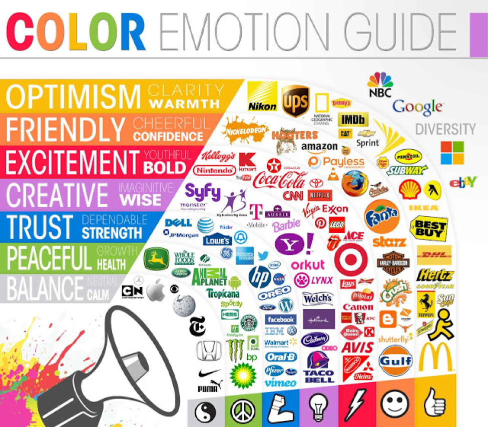
Use of Colour in Visual Identity
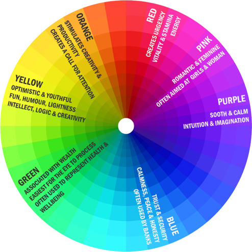
I started to consider the different elements which can build a visual identity of a brand and how it can affect the psychology of the public. I began with looking at colour and how different colours used in brands can affect the perception of brand image.
The above chart gives a good example of how the different colours can change this and how brands can use this within their visual identity.
Visual Identity: Promoting and Protecting the Public Face of an Organization- Susan Westcott Alessandri (2009)
Key Quotes
- 'An organisation's image typically results from two type of associations- those that are inherent and those that are built over time'
- 'Just a person's name, appearance, clothing style, and behavior make up his or her identity, and organisation's visual identity stems from its mision and manifests itself in the organisation's behavior and the visual way it represents itself: its name, logo, tagline, color palette, and even the architecture of the buildings in which it is housed'.
- ' Consumer packaged-goods companies may habve the most visible of visual identities, since the public is used to seeing these identities in a variety of media, but organisations of all sizes, types, and levels notoriety have visual identities.'
- 'A positive identity is establishes in order to gain a favourable reputaion over time'.
Development of Essay Question
‘To what extent does visual identity affect the public perception of a product or brand?’
Through my continued research over summer, I have revised my original essay question and have tried to focus on a more specific element of branding and marketing, whilst still keeping potential topics quite open ended.
My revised essay question allows me to investigate marketing and branding, as well as it's effects on public perception of a brand- meaning I will have to use a few case studies to back up and re enforce my arguments.
Visual Identitiy
One term that has kept coming up through my research is the idea of a company's 'visual identity', here is a quick definition:
'Visible elements of a brand, such as color, form, and shape, which encapsulate and convey the symbolic meanings that cannot be imparted through words alone. In a broader (corporate) sense, it may include elements such as building architecture, color schemes, and dress code'.
I think for my research, this is a really good direction for me to move towards- rather than focusing on branding and marketing, I think I should be looking specifically at the visual identity of a company, as I think it encompasses marketing, branding and public perception as a whole.
'Brand Thinking and Other Noble Pursuits'- Debbie Millman
Brand Thinking and Other Noble Pursuits by Debbie Millman is a collection of interviews from the worlds leading visual branding experts.
Here are some key quotes.
'My view is that branding is the process of attaching an idea to some object, or to a service or organization.'- Rob Walker
'I would define it two ways: from the sender’s point of view and from the receiver’s point of view. I don’t want to make it overly complicated, but from the perspective of P&G or Dell or any other company, a brand might be a promise: a promise of what awaits the customer if they buy that particular product, service, or experience. From the receiver’s point of view, I think a brand is a promise … a promise of what you can expect if you use the product or service, or if you engage in the experience.'- Daniel Pink
Apple Re-brand
I initially wanted to look at the logo, which really hasn't changed much. Aside from the colour and some subtle textural changes, the Apple logo has remained the same, which represents the company's intended image- clean and sleek.

I then went on to investigate how the company advertises it's products to the public, as this is generally how the public form their opinion of the product or company.

The above advertisement is from around 1977, and although it is worlds away from the stuff we see today, it still invokes the basis of the companies ideas. The simple imagery of the product being used in a family environment, with the product name at the top. The advert is still very simple, and definitely sets the foundations of the modern advertising we see today.
McDonald's Re-brand
Moving on from my project proposal, I wanted to start by investigating companies who have gone through extensive re-brands since their inception. McDonald's was a good example to use. Since the company has been around since around 1937, I had a larger timeframe to work from and a larger amount of re-brands to investigate.
However, the biggest change Mcdonald's had was in around 2007 when it moved heavily towards the use of a green background and starting to veer away from the traditional red.

This came about just 3 years after the release of the popular documentary 'Super-Size Me', which pointed out the negative health issues cause by McDonald's menu and started a huge backlash against the company.
The change to green was probably to try and convey an image of health and positivity and try to change public perception of the brand.
One of the biggest changes to this re-brand was the complete overhaul of the McDonald's stores. Previously, the stores were bright and artificial, coinciding with the 'old' marketing style of 'the brighter the better', and changed to a more modern, clean and sophisticated colour palette and design.
However, the biggest change Mcdonald's had was in around 2007 when it moved heavily towards the use of a green background and starting to veer away from the traditional red.
This came about just 3 years after the release of the popular documentary 'Super-Size Me', which pointed out the negative health issues cause by McDonald's menu and started a huge backlash against the company.
The change to green was probably to try and convey an image of health and positivity and try to change public perception of the brand.
One of the biggest changes to this re-brand was the complete overhaul of the McDonald's stores. Previously, the stores were bright and artificial, coinciding with the 'old' marketing style of 'the brighter the better', and changed to a more modern, clean and sophisticated colour palette and design.
Subscribe to:
Comments (Atom)